Daraz Logo, Color, Font and History
Daraz Logo:

Color
Used: Orange
Color
Meaning:
Orange color is a sign of optimism, confidence,
enthusiasm, warmth, and agreeableness.
Color is key
for the Daraz logo. This palette wasn’t used just for the sake of its looks,
but it conveys a certain message referring to the brand’s promise.
Brand
Slogan:
A world with endless possibilities.
Font
Used:
It used a custom typeface called Daraz Sans.
The typeface stands proud and confident and reflects the playful angles and
corners of the box icon.
Background:
Daraz was established in Pakistan in 2012.
Today, it’s the country’s leading online marketplace and logistics company,
which works in several markets of South Asia and Southeast Asia. Founded
by Rocket Internet, Daraz was purchased by the Chinese giant Alibaba
Group in 2018.
From 2012 to 2018:
The most striking feature of the
earliest logo was the black background. The brand name was placed inside of a
pure black plate, the left side of the plate resembled a rectangle, with
rounded corners, and the right side resembled an ellipse.
The white
wordmark was written in rather thin letters, and as a result, it didn’t carry
much weight, allowing the black background to take over.
On the right
side of the logo, there was a bright spot. It was made up of several
overlapping circles, each in different colors, such as green, yellow, red, etc.
It’s safe to
assume that the black and white part of the logo represents the traditional
elegance and chic of clothes sold on an online marketplace. The large splashes
of color on the right side, on the other hand, are meant to represent the funky
items that are also available on the marketplace for risk-takers.

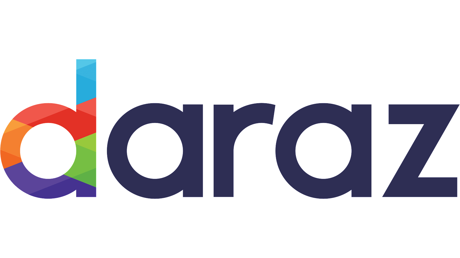
From 2018
to 2022:
The update
was introduced in 2022, the same year that Daraz was taken over by Alibaba
Group. The Daraz logo has been completely redesigned, but we can see that
the designers have made an effort to keep some of its heritage intact. The only
element that has been changed is the wordmark, which is an austere sans
lettering. The shape is pretty much the same as the previous one, but the
letters are a bit heavier to make it easier to read. The second logo doesn’t
have the same dramatic black as the previous one. However, the palette retains
much of the same visual language as the previous logo. For the first time,
black has been replaced by navy blue, and the vivid colors have been moved to
the very beginning of the word “d”. They’re still pretty bright, but the set of
colors is a bit more diverse now, with blue and purple added to the mix. The
bright part of the logo is also more simple, with fewer shades of the same
colors.
From 2022
to Today:
The redesign
of 2022 has created a bright and stable Daraz badge, which is completely
different from the two previous versions. The difference number one is the
composition itself: now the logo is formed by two elements, a geometric
emblem, and a title case lettering on its right. The emblem is a stylized
solid hexagon with the upper right triangle being cut out and attached to the
top border, making up a white triangle, which looks like a “Play” Button, in
the negative space. The second thing is the color palette — the new version
is set in an intense orange-and-white scheme, which evokes a sense of energy,
motion, and power.


Comments
Post a Comment