Typography, Fonts Alignment, Kerning | All Designers Need To Know

Definition:
Typography is the art and technique of arranging type to make written language legible, readable, and appealing when displayed.
Typography is everywhere we look. It’s in the books we read, on the websites we visit, and even in everyday life—on street signs, bumper stickers, and product packaging.
Typography is the art of using text. If the design is good but the text is not used well it means that the particle from which we communicate with our design is incorrect.
For example: If someone is physically attractive but lacks strong communication skills,
their personality may suffer. Similarly, If the design is good but the typography is bad,
then the overall design will suffer.
To comprehend typography, it is essential to understand the terms such as
font, typefaces, etc.
Font:
The word font refers to a set of printable or displayable typography or text characters
in a specific style and size. Font styles are used in both print and digital text.
One of the font families is also called Typeface.
Difference between Font and Typeface:
While a typeface describes a particular style of lettering, a font refers to variations of
a typeface, like its size and weight. The simplest way to understand this difference is
that a typeface is a set of fonts with common aesthetic qualities.
Typefaces are clothes of words and like a finely tailored suit, it’s the detail in
their composition that adds interest.
Types of Typefaces or Fonts:
Serif Fonts
Sans Serif Fonts
Decorative Fonts
1.Serif Fonts:
A serif font is a font with small strokes or extensions at the end of its
longer strokes. Serif is mostly used in classic designs, newspapers books, etc.
It is used mostly in printed media.

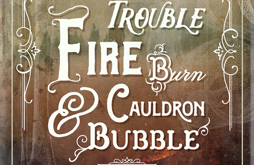
3. Decorative Fonts: Sometimes called script, novelty, or ornamental, decorative fonts stand out for their unique shapes and personalities. These tend to have a stronger personality or character than traditional serif or sans-serif fonts. It is not for Paragraphs or titles.


In this design, different fonts are used which makes it look flashy and not eye-catching.Simplicity is good. Use one font with different weights or styles for emphasis.


Comments
Post a Comment